Losing steam when training
A fitness app concept that makes community and competition a core aspect of the experience to tackle fading motivation in users
Competition
Activity
Role
Product Designer
Timeline
2 weeks
team
Me
platform
Mobile

Overview
Surge is an activity tracking app designed for two kinds of users: people who train intensely and regularly, and everyday casual users who want to stay active without the pressure of serious competition. The product serves both at the same time
The problem
Most fitness products are designed for the individual user to log their steps, calories and workout sessions and by the time they're done for the day, the close their app. No one is waiting for them tomorrow, if they fail to show show up, they'll be lucky to get a reminder by the product's mascot. The motivation to keep going does not scale up as time goes on, it actually reduces and before you know it, the app is already dormant and hasn't been opened in the past 6 months
Research
I spoke to 10 people who engage in gym, sports and other activities who live around me. I conducted a qualitative research with them and one of the main questions i asked them was how they felt about training in isolation and the summary of what they said was whenever they train alone in isolation, they lose their motivation faster. From further questions, i found out that this loss of motivation is not because they no longer want the goal they originally set out to achieve but because there is nothing keeping them accountable beyond their willpower. And willpower as we know it can only go so far especially during the difficult months where they are putting in the work but they can't see any result
Solution
I proposed activity-based communities and shared sessions as a way to support accountability. The core loop is: choose what activities they participate in, join a group of those who participate in the same activity, respond to an event, take part in a session, and decide whether to return. Competition is optional and should not make casual activity feel high pressure.

Design decisions
Use color to show activity and state
Each activity has a color that carries through its community, event card, session timer, and leaderboard. Event cards have default, interested, and ignored states. Interested and ignored choices are reversible, and the card remains available until the event passes.
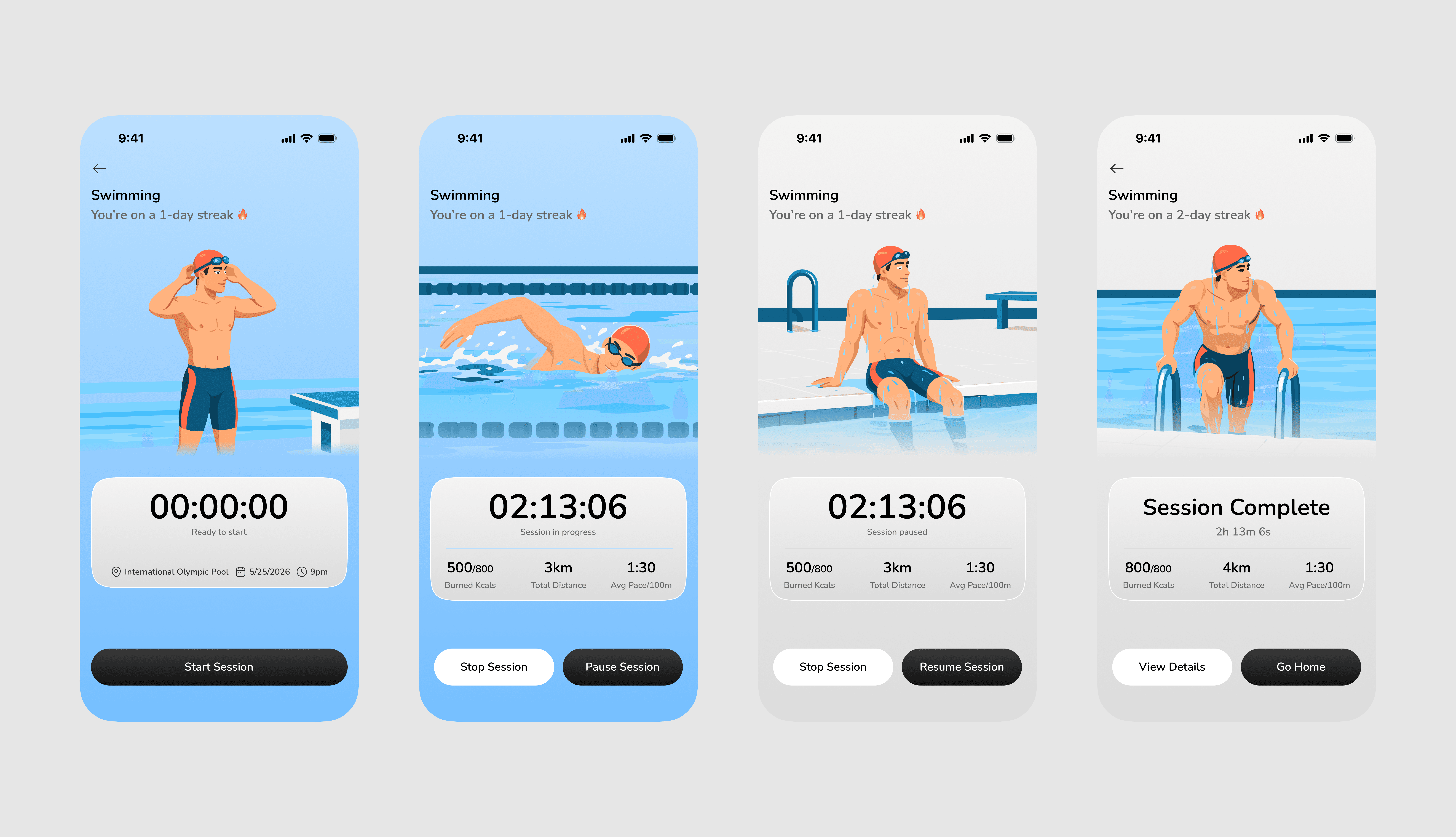
During a session, the color moves through ready, active, paused, and stopped states. Activity color is strongest while the session is active and becomes neutral when it is stopped.
Rounded corners & elevation
Color is not the only decision carrying the welcoming layer. Every UI element in Surge starting from cards, buttons, input fields, bottom sheets use well-rounded corners and have a little bit of elevation to them. These 2 work alongside the color palette to make the product feel approachable and warm regardless of which screen the user is on. These are decisions that non-vigilant users may never consciously notice, but it helps define their experience
Red for intensity
Red is the primary color in Surge and it was chosen specifically for the users who want more. More competition, more intensity, more from their active life. The red gradient contributes to the overall palette while serving a distinct purpose: it signals that this is a product with real stakes for users who want them.
This shows up most clearly in the quarterly global leaderboard. To receive a global leaderboard invitation, a user has to be among the most active members in their community, one of the top five. These are the intense users the global leaderboard was designed for
The global board they compete on uses red as its theme color regardless of which sport the user came from. A swimmer, a cyclist, a basketball player all arrive at the same red stage which is the global level, sport identity steps back. Surge's identity steps forward.

Community
Active people connect around their activities. Surge handles this by auto-assigning users to activity-specific group chats based on the activities they choose during onboarding. A user who picks cycling joins the Cycling Team without any extra step.
Sent message bubbles inside the chat use muted versions of the activity color. using full intensity would compete with the text content so to eliminate that, i used a muted version that signals identity without creating friction for the reader
Events
Community events surface as inline cards inside the group chat and they exist in three states:
Default: The card carries full activity color and presents two options: Ignore or I'm Interested.
Interested: The card retains its color and the button becomes outlined, confirming the selection without removing the option to change it.
Ignored: The card loses its color entirely. the button reads "I'm Not Interested." The card stays visible incase the user changes their mind. The color draining communicates that this is no longer active for them without removing their access to it.
Every state is reversible. The card disappears only when the event date passes.
Session flow
Starting a session brings up a screen with the full activity color. The screen tracks four states: Ready, in progress, paused, and stopped. As the session moves from active to stopped, the color drains and the stopped state is completely neutral. I used the colors as state language where saturated means active, grey means done.
The session timer integrates with the Dynamic Island on iPhone where users can dismiss the bottom sheet and navigate freely around the app while their session runs. The timer stays visible and the session stays alive

Iteration history of session flow
Designing the session flow experience wasn't straightforward. The first draft was a bottom sheet and it slowly evolved into a full screen of it's own, gained its own custom illustration that changes based on the state of the session

The leaderboard
Monthly community leaderboards are scoped to each activity group and the most active member by active minutes tops the board each month. The previous month's winner holds the Pace Setter title and appears on the preview card shown to users being invited to join. Participation is opt-in.
Quarterly global leaderboards
Invite the top five most active members from each community to compete across all activities every three months. Win history is tracked permanently where a user who has won three global editions carries a 3x Winner label next to their name. The global board uses red as its theme color, reflecting that at this level, the competition belongs to the whole product.
Users who qualify are notified on their home screen or inside their community chat, contextually surfaced where they already are

What this process revealed
As the concept developed, activity colors became the main state language. The neutral card shifted into the role of an inactive or ignored state. That changed how I used the original component system.
What I would validate next
I would ask people who train with others and alone to review an invitation, join or decline a session, and understand the leaderboard settings. I would look for signs of useful accountability and unwanted pressure. I would test opt-in and reversible states before expanding the competition model.