The freeze retreat
An Arctic retreat landing-page concept using glacial photography, icy color, and editorial type to create a premium mood.
Retreat
Arctic
Role
Product Designer
Timeline
3 days
team
Me
platform
Web

Give an Arctic retreat a distinctive visual presence
The Freeze Retreat is a landing-page concept built around glacial photography, a cool blue palette, editorial serif type, and a clear reservation call to action. The hero establishes the mood, while the experience cards introduce the retreat offering.
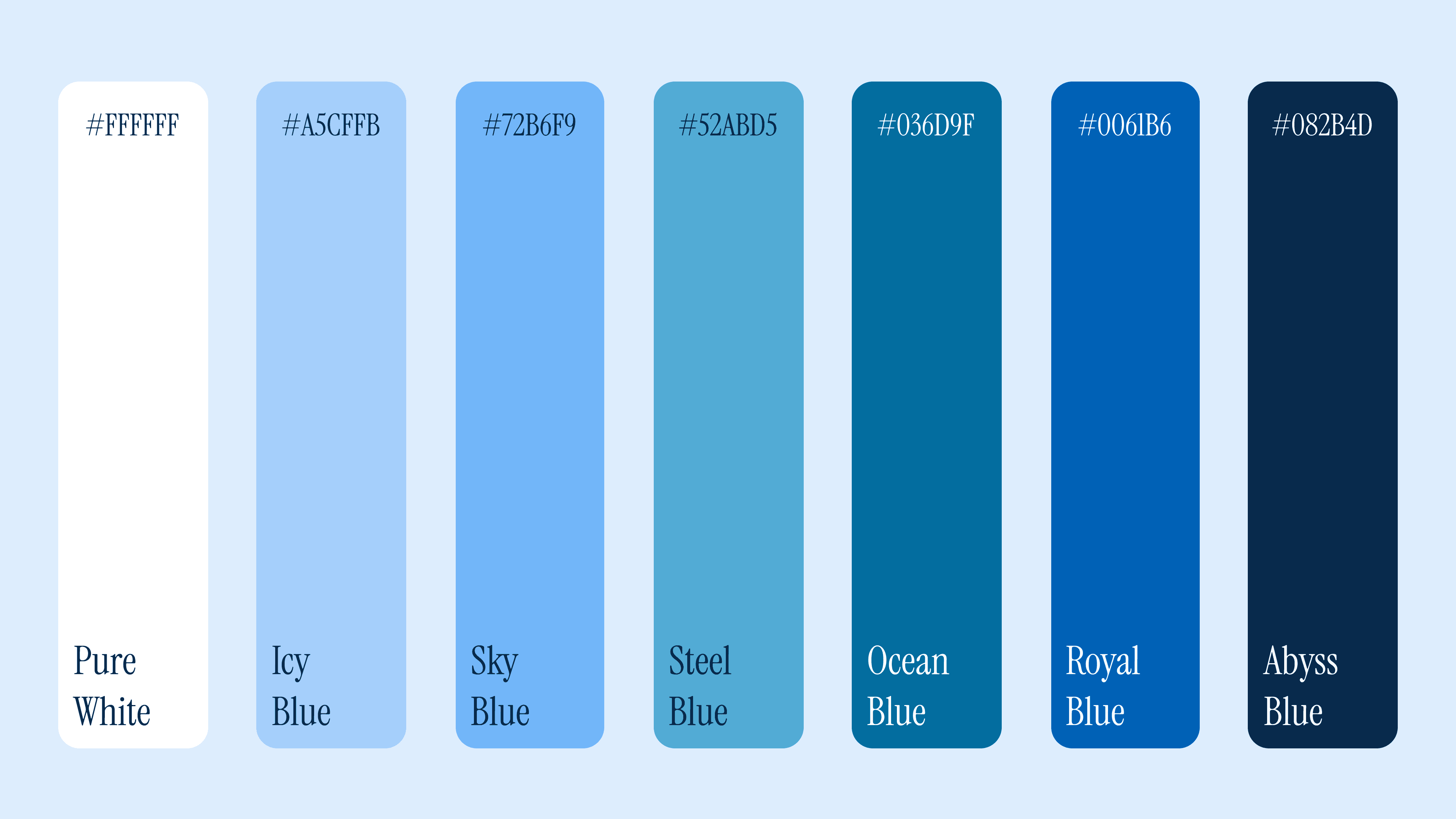
Color system
The palette was pulled directly from the source image rather than chosen. Seven steps from pure white through icy blue to abyss. A monochromatic scale that communicates exclusivity without a single warm tone.
Monochrome communicates restraint while restraint communicates premium. The colour system does the brand positioning work before a single word is readnt question: what if the interface itself communicated that this product was built with intention?

Real photography
The most interesting accessibility failures aren't careless ones. They're the ones where a system did something thoughtful, built a stepped scale, documented semantic colors carefully, controlled tints centrally and a gap appeared in a place the same logic wasn't extended to.
Typography
Two typefaces carry the brand. Instrument Serif handles all expressive headlines and pull quotes. High contrast, editorial, with the kind of elegance that reads as considered. Geist Sans handles all functional UI text, it is geometric, light, precise.
The pairing creates a deliberate tension. The serif feels emotional and human. The sans feels cold and minimal. Together they read as luxury without warmth, which is exactly the brand
Emotional arc
The landing page follows a deliberate sequence,
the hero is full-bleed and immersive making the image do the selling before user reads any copy.
The stats bar follows immediately, anchoring credibility at the exact moment the emotional peak is highest.
The experiences grid breaks the expected three-column pattern with an asymmetric layout, two small cards left, one dominant card right to create visual hierarchy without instruction.
Testimonials are framed around a single featured pull quote with supporting cards.
The footer CTA returns to the tagline, closing the loop the hero opened.
Every section earns its place by moving the reader one step closer to believing that cold is exactly where they want to be

How it came together
The source photograph already contained the answer. Vertical icicles as natural frames, a purple-dusk sky, glacial mist and a palette of deep monochromatic blue and icy white.
The design blended directly into the image rather than fight it. Every decision that followed came from one question: does this make cold feel like something worth travelling toward?