Crypto Anxiety
A wallet concept that makes seed-phrase entry, backup risks, and transaction errors easier to understand.
Strategy
web3
Role
Product Designer
Timeline
3 months
team
Me, Myself and I
platform
Mobile

Make wallet recovery and backup steps easier to understand
Crypto Anxiety explores how a wallet could communicate sensitive actions with less ambiguity. The concept focuses on access recovery, seed-phrase entry, backup acknowledgements, and transaction errors.
The design response
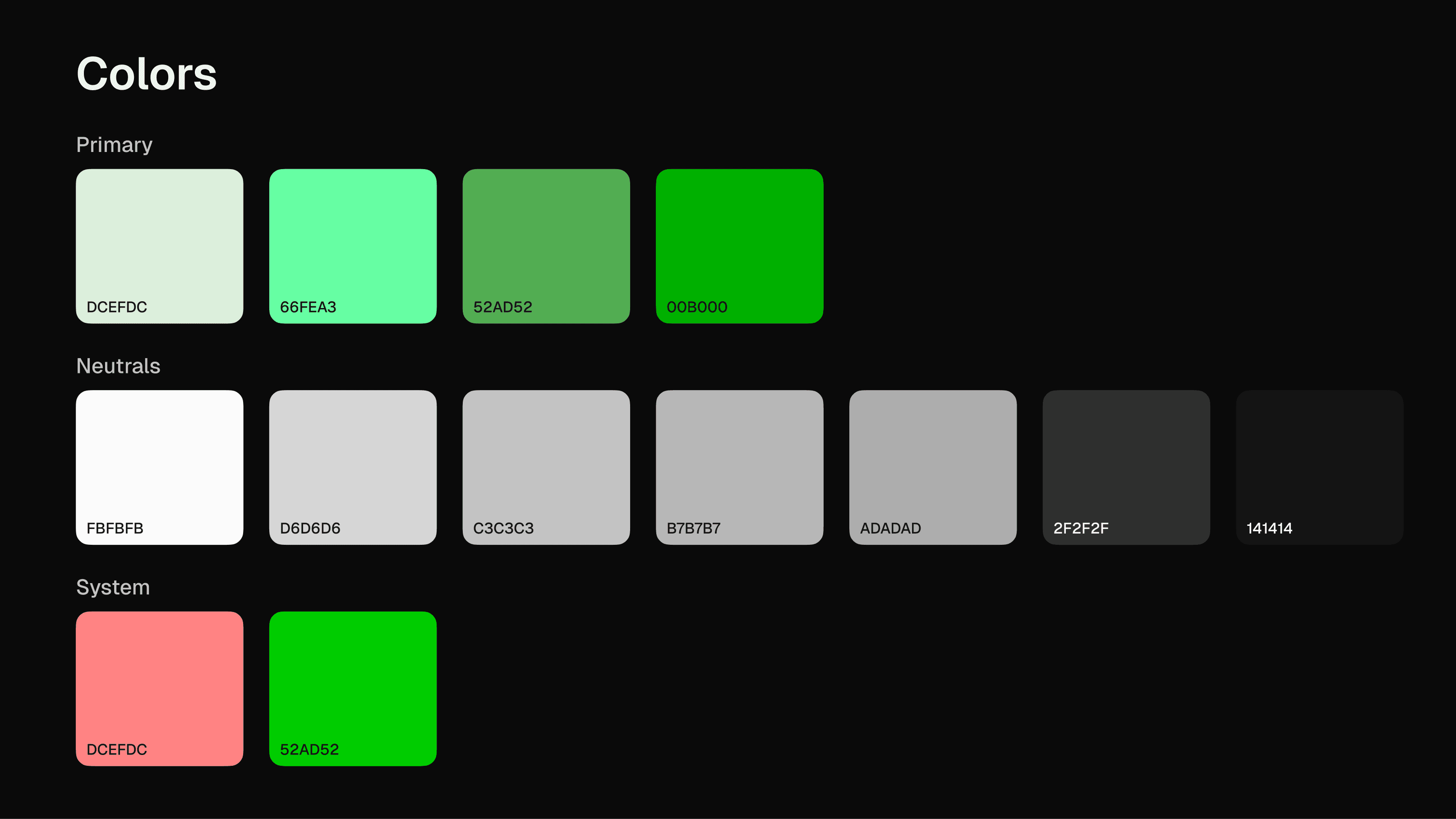
I explored calmer error states, tactile seed-phrase entry, and explicit acknowledgements before a user proceeds without a backup. The visual system uses a dark interface with bright accents. These choices aim to make the next step clear; they do not prove that users feel less anxious or complete recovery more often.
Evidence and limits
I collected and analyzed 60 google play store reviews in September 2025 to find out what problems users were having. Some problems were tagged technical while others could be solved by design for example: i found out how devasted users felt when they lost their portfolio because they didn't understand how important their seed phrases were. Some users lost it due to negligence while others fell for a scam that asked for their key and they naively gave it

Who this is for
The concept focuses on a first-time or less-confident wallet user who is interested in crypto but unsure how to protect access to their funds. The persona is a design tool based on the review analysis, not a validated representation of every wallet user.
Competitive landscape
Trust Wallet, MetaMask and Coinbase Wallet all make the same visual assumption. Flat, clinical interfaces with conventional fintech styling. White/Black backgrounds, standard sans-serif type, red error states.
The design language communicates neutrality rather than intention but neutrality just avoids the problem instead of building trust with the opportunity . When a user is handling real money in software they don't fully understand, a neutral interface gives them nothing to hold onto, it doesn't signal that the people behind the product took it seriously, everything just looks like every other fintech product from the last five years.
The gap in the market was a feeling, no existing wallet was designed to feel considered, physically weighted and emotionally calm at the moments that mattered most
Painpoints mapped to decisions
1) Red error states amplify fear at the worst moment so i removed red entirely from all error states and designed a muted, calm, atmosphere that encouraged users to try again across failure states.
2) Seed phrase input feels fragile and frightening so each word slot was designed as a an elevated component so it feels placed and not typed, a deliberate decision not to be fragile
3) Users don't genuinely understand what they're agreeing to during backup so i designed 3 explicit checkboxes to actively engage users, the continue button is withheld until all three are checked.
4) Flat clinical interfaces signal indifference so i designed a dark ambient atmosphere, inner shadows, recessed surfaces. Every element has physical weight so the product looks like someone cared about building it

Flat UI & Tactile UI
My first direction followed familiar wallet patterns: dark surfaces, flat components, and glow effects. I changed course toward contained, recessed surfaces so the seed-phrase and backup steps felt structured. The side-by-side visual shows the change. This visual direction is a hypothesis about clarity and reassurance, not proof that it builds trust

2nd iteration - Seed phrase input field
The first version used one empty text field. After a usability session, I changed it to individual word slots. The slots show how many words are expected and where each one belongs.
I was able to get 5 people to help me test this through a moderated usability study. I tasked them to enter their seed phrases manually and one of the standout things they said was "How many words does this require?" the obvious answer to this is for them to check where they had written down their original phrases.
However this gave me an insight that users would benefit from a visual cue of what's required of them in the input field
This visual cue also matched the visual direct i was already exploring for the project much better than the blank input field


User acknowledgement
The concept asks users to confirm three backup-risk statements before continuing. I chose explicit acknowledgement because losing a seed phrase can mean losing access to funds. I still need to test whether people can explain the risk after reading the statements, rather than simply checking every box to proceed.

Design principles
Emotional context shapes visual direction
Every screen has a user feeling behind it and the design needs to respond to that feeling first, the task second. My hypothesis is "A user who feels calm will complete the flow while the user who panics will abandon"
Convention is a starting point, not a rule
Errors don't have to be red, depth doesn't have to be non existent. I think every convention exists for a reason but that reason has to hold up in context but when it doesn't, it needs to be replaced
Visual weight communicates intention
I believe a product that looks considered tells the user it was built by people who care. In a space where trust is the product, that signal matters more than any feature.
What I would validate next
I would ask participants to recover access, enter a seed phrase in the prototype, and respond to a backup warning and a transaction error. I would check whether they can explain each risk, identify the next step, and recover from an error without being coached.
Visual captions: Show the seed-phrase entry and backup acknowledgement together. Add the error state and point out how the user returns to a safe next step.
Reflection: A calm visual tone is only useful if the instructions are understood. I would test comprehension and recovery before claiming that the concept builds trust.
This philosophy transfers to any high-stakes product
The decisions in SlimeWallet weren't specific to crypto, they are specific to users who are anxious, uncertain or making consequential choices. This easily describes users in health, fintech, legal, insurance, anywhere the stakes are real.
I design for what the user is feeling at every step, not just what they're trying to do. The visual direction, the interaction flow, the copy, everything connects back to one question: does this make the user more confident or less?
If that's the kind of problem your product has, I'd like to work on it with you
The full product

