Ball - Context First
A football app concept that changes match-feed structure for live viewing and catch-up
Sports
Football
Role
Product Designer
Timeline
8 weeks
team
Me
platform
Mobile aoo

A live match and a finished match need different feeds
Ball explores a football feed that responds to why someone opened it. During a live match, a fan may want to scan updates by team. After the match, a chronological feed may make it easier to catch up on what happened.
Research
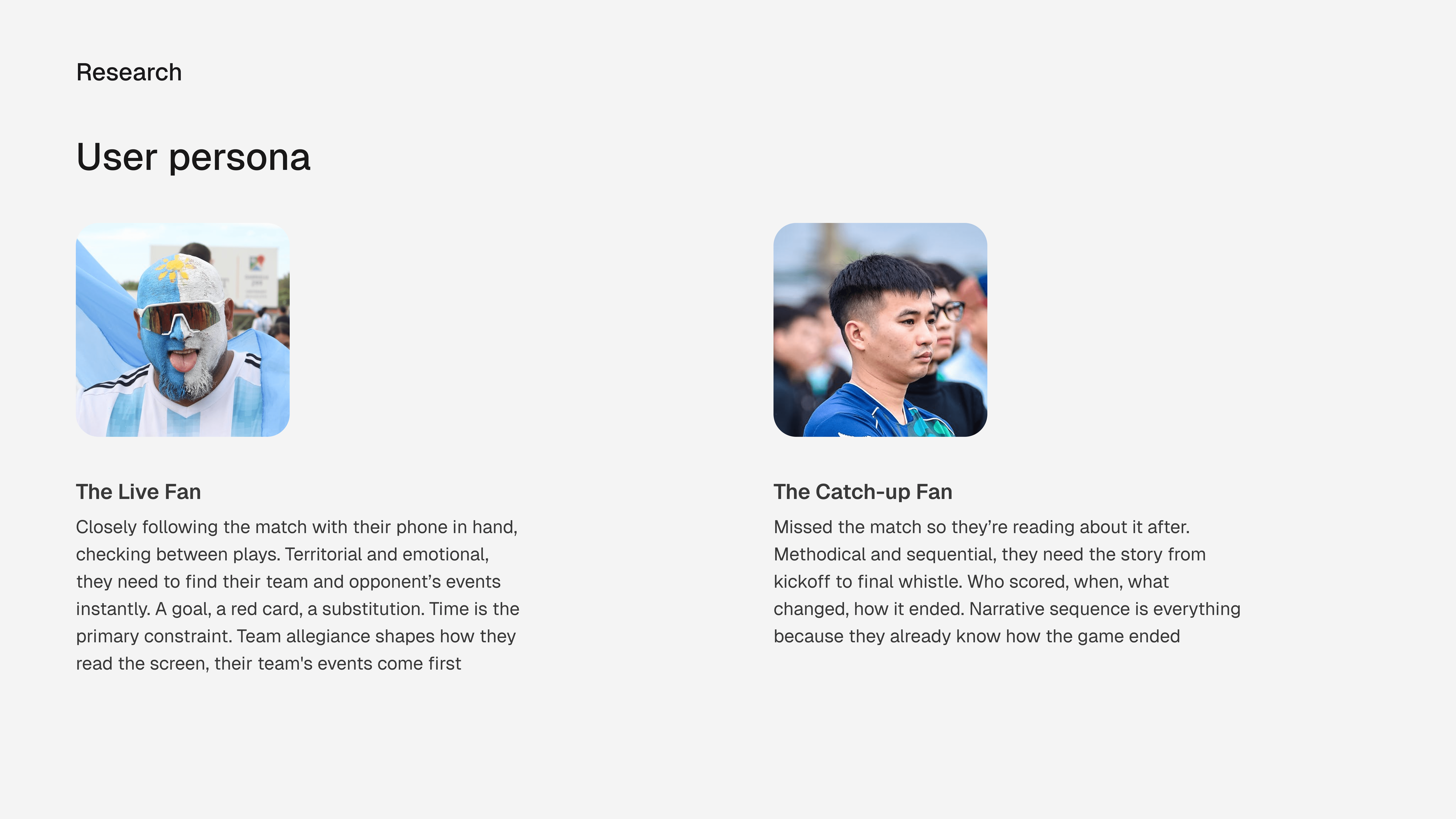
I collected 50 app-store reviews for a secondary qualitative research across FotMob, OneFootball, and Sofascore in 1 week, alongside my own experience as a football fan and FotMob user. I analyzed these painponts and grouped them into what the users need. Events, notifications, UX flows and Catch-up
What fans said
The reviews described problems with delayed or missing events, red cards appearing late, incorrect goal-scorer notifications, and match trackers that did not work. These are reported review themes, not a measure of how common each problem is.
Catch-up creates a different task: the fan is reading a match story after it has ended, not scanning for the latest event while it is live.
Product decision
While checking out other products, i observed that they only switch the order of events during a match. During the match events that happen at 1st minute gets pushed down by events that happen later and at the end of the day, they flip the entire chain
The case comparison suggests that changing event order alone may not address the difference between live scanning and catch-up reading so I proposed a team-split feed during a live match and a centered chronological feed after full time for easy scanning and understanding the order of events.
This switch is a proposal. I have not tested whether fans notice it, understand it, or prefer it.

The decision
I explored three feed structures and proposed changing the layout when the match ends: a team-split view while the match is live, then a chronological story for catch-up. The proposed switch is automatic. That keeps the concept focused on one product decision instead of treating every match feature as equally important.



Match details screen - Solution
The layout changes when the match ends. Based on context
When designing the match details screen, two layouts emerged, each clearly right, but for different users at different moments.
Why this isn't inconsistency
Inconsistency is when the same element behaves differently for no reason the user can understand. This is different, the layout shifts because the situation has genuinely changed and the "Fulltime" label already on screen signals that change clearly.
The user doesn't need to do anything, the app reads the match state and serves the right layout automatically. No toggle, setting or decision is required.
The analogy is a live news ticker vs a published article. Same story, completely different presentation. The context makes the difference obvious clear
What I would validate next
I would ask football fans to follow a match live and then find a key moment after full time. I would test whether they understand the layout change and can find the same information in both modes. I would also check extra time, penalties, suspended matches, and opening the app at full time.
The next design change should respond to those observations. No improvement in speed or fan satisfaction is claimed yet.